How to Design a Fitness App UI in Sketch

In this Sketch tutorial you will learn how to design a fitness app dashboard.
To begin with you will learn how to create the starting components of an app dashboard for iOS. You will learn
- how to create a basic navigation bar,
- how to save and use symbols
- and how to create a smart layout.
All these little features will ease your work throughout this free fitness app mockup tutorial.
- Next, using simple shapes, paths, and vector shape building techniques, you will learn how to create and import icons inside your fitness app dashboard.
- Using subtle shading techniques, symbols or nested symbols and some text, you will learn how to add color and vibration to your fitness app design template.
- Finally, you’ll learn how to easily multiply objects and how to create the bottom navigation menu.
For more inspiration on how to adjust or improve your final fitness UI kit you can find plenty of resources at GraphicRiver.

What You Will Need:
You will need the following resources in order to complete this fitness app dashboard. Most of these are available from Envato Elements, where a single subscription allow you unlimited downloads. You can also find alternatives to work with if you prefer:
1. How to Set Up the Artboard
Go to Insert > Artboard from the toolbar or menu (or press A) and the Inspector will reveal a list of artboard templates. Click the iPhone 11 template to create a 414 x 896 px artboard. Once you’re done, hit Escape to deselect your artboard. Now, let's start the work on this free fitness app mockup.

2. How to Add a Navigation Bar in a Fitness App Design Template
Step 1
Go to Insert > Shape > Rectangle from the toolbar or menu (or press R). Click and drag to create a 414 x 70 px shape, place it as shown in the following image and make sure that it stays selected.
Go to the Inspector panel and focus on the Style section. Uncheck the Borders checkbox to disable the border applied to your rectangle and keep the default Fill color.

Step 2
Go to Insert > Shape > Oval from the toolbar or menu (or press O). Hold down the Shift key to create a perfect 40 px circle, make sure that it stays selected and focus on the Inspector panel.
Use the X & Y input boxes to numerically place this new shape. Enter 35 in the X box and 64 in the Y box and your shape should move to the left side of your grey rectangle, as shown in the following image.
Keep focusing on the Inspector panel and move to the Style section. Disable the existing Border and change the Fill color to #F5F5FF.

Step 3
Go to Insert > Vector from the toolbar or menu (or press V). Use three simple clicks to create the arrow shape shown in the following image. Place it as shown below and make sure that it stays selected.
Go to the Style section from the Inspector panel, disable the existing Fill and change the Border color to #4B4B87.

Step 4
Go to Insert > Text from the toolbar or menu (or press T). Click once on your artboard and focus on the Text section from the Inspector panel.
Select the San Francisco Compact Rounded font, change the style to Bold, set the size to 24 and the color to #4B4B87, and then simply type the "STATS" piece of text. Place it as shown in the following image.

3. How to Add a Horizontal Menu in a Fitness App Design Template
Step 1
Go to View > Canvas > Show Rulers (or press Command-R) to activate the Rulers. Right click on your rulers and go to Show All Guides as we’re about to add some new guides.
Focus on the horizontal rulers and move your cursor inside it. Move your cursor to 20 px and simply click to add a new guide. Guides can be moved and repositioned by clicking-and-dragging the guide inside the rulers. Keep focusing on the horizontal rulers and use the same technique to add a second guide at 394. Now that the guides are in place, you can continue the work on your fitness dashboard template.

Step 2
Go to Insert > Shape > Rectangle from the toolbar or menu (or press R). Create a 374 x 40 px shape, make sure that it stays selected and focus on the Inspector panel.
First, use the X & Y input boxes to numerically place this new rectangle. Enter 20 in the X box and 139 in the Y box and your shape should move to the top side of the artboard, as shown in the following image.
Keep focusing on the Inspector panel, drag the Radius slider to 20 and then move to the Style section. Disable the existing Border and change the Fill color to #F5F5FF.

Step 3
Go to Insert > Shape > Rectangle (R) and create a 122 x 36 px shape. Place it as shown in the following image, make sure that it stays selected and focus on the Inspector panel
Drag the Radius slider to 18 and then move to the Style section. Change the Fill color to #4B4B87 and delete the existing Border using the Trash button.

Step 4
Make sure that the rounded rectangle made in the previous step is still selected and focus on the Style section from the Inspector panel.
Click the Shadows button to add a shadow for your selection. Enter the numbers shown in the following image and then click the color well. Change the color to #4B4B87 and then lower the Alpha to 80.

Step 5
Go to Insert > Text (T), add the "Day" piece of text and place it as shown in the following image. Use the San Francisco Compact Rounded font and change the style to Semibold. Set the size to 16 and the color to white (#FFFFFF) and don't forget to change the Alignment to Center.

Step 6
Select the rounded rectangle and the piece of text highlighted in the following image and click the Create Symbol button from the toolbar, or choose Layer > Create Symbol in the menu.
Name your symbol "Button.Active", select a Left to Right Layout and click OK. This will create a master symbol separate from your artboard. If you make a change to a master this will also show in any instances of that symbol in your document. That Left to Right Layout will help you later to create a smart layout.

Step 7
Go to Insert > Shape > Rectangle (R) and create a new 122 x 36 px shape. Place it as shown in the following image with the help of the Smart Guides. Make sure that it stays selected and focus on the Inspector panel
Drag the Radius slider to 18 and then move to the Style section. Change the Fill color to #F5F5FF and disable the existing Border.

Step 8
Go to Insert > Text (T), add the "Week" piece of text and place it as shown in the following image. Use the San Francisco Compact Rounded font and change the style to Semibold. Set the size to 16 and the Alignment to Center, and then click the color well. Set the color to #4B4B87 and lower the Alpha to 50.

Step 9
Select the rounded rectangle and the piece of text highlighted in the following image and create a new symbol (Create Symbol button from the toolbar or Layer > Create Symbol in the menu). Name this new symbol "Button.Inactive", select a Left to Right Layout and click OK.

Step 10
Make sure that the symbol made in the previous step is still selected. Hold down the Option key and simply drag your selected symbol to duplicate it. To constrain movement of your copy to a single direction, hold down the Shift key while dragging. Drag this copy to the right until the Smart Guides shown you that there's a 2 px gap between the copy and the original symbol.
Select this copy and focus on the Symbol section from the Inspector panel. In the Overrides box simply enter "Month" to change the text from your symbol copy.

Step 11
Select your three symbols along with the rounded rectangle that lies in the back and save them as a new symbol. Name it "HorizontalMenu" and don't forget to select the Left to Right Layout.
Now, here's where that Left to Right Layout eases your work. Let's say that you decide to remove one of the buttons. All you have to do is select it, go to the Symbol section from the Inspector panel and select No Symbol from the Overrides menu. This will immediately remove the undesired button and the space that it covers. Having the Layout set to None instead of Left to Right would remove the button, but keep the space that it covers empty.

Step 12
Using the same Overrides menus you can easily change the appearance of your buttons. These are pretty basic changes, but you'll learn more powerful techniques in the following steps.

4. How to Create Symbols for the Fitness App Dashboard
Step 1
Go to Insert > Shape > Rectangle (R), create a 30 px square and place it somewhere in the bottom of the artboard. Make sure that it's selected and go to Arrange > Make Grid. Enter the attributes shown in the following image and then click the Make Grid button. This will add five copies of your square in an evenly spaced row, as shown in the second image.

Step 2
Focus on the leftmost grey square. Go to Insert > Shape > Oval (O) and create a 28 px circle. Fill it with white and place it as shown in the first image. Create a 34 px circle, fill it with white and place it as shown in the second image.
Select both circle made in this step and click the Subtract button from your toolbar.

Step 3
Make sure that the shape made in the previous step is still selected and go to the Style section from the Inspector panel. Be sure that the Fill color is set to white and then focus on the Border. Change the color to white, set the Alignment to Center, increase the Width to 2 and don't forget to check that Round Join button.

Step 4
Go to Insert > Text (T), add the "Z" piece of text and place it as shown in the first image. Use the San Francisco Compact Rounded font and change the style to Semibold. Set the size to 16 and the color to white (#FFFFFF).
Duplicate this piece of text (Command-C > Command-V). Select this copy and lower the font size to 12, and then place it as shown in the second image.
Select both pieces of text added in this step and go to Layer > Convert to Outlines to convert the text into an editable vector paths.

Step 5
Import the flame icon from this 14 Flame icons pack and the other four icons from this Fitness Glyph Color Icon Set. Change their color to white and resize them to fit the grey squares, as shown in the following image. Make sure that none of these icons exceeds the 30 px width and height.

Step 6
Just to make it easier for you to understand the next two step, let's change the color of the artboard. Click the name of your artboard to quickly select it, focus on the Inspector panel and change the background color to black (#000000).

Step 7
Focus on the leftmost grey square. Select it, focus on the Inspector panel and disable the Fill to basically make your selected shape invisible.
Select this invisible shape along with the icon that lies above it, create a new symbol and name it "Sleep".

Step 8
Move to the next grey square and make it invisible. Select it along with the icon that lies above it, create a new symbol and name it "Hear Rate".
Continue with the other four icons and use the same technique to create the "Energy Burn", "Steps", "Running" and "Cycling" symbols.

5. How to Create Complex Symbols for Your Fitness App Design Template
Step 1
Change the color of your artboard back to white. Go to Insert > Shape > Rectangle (R) and create a 177 x 180 px shape. Place it as shown in the following image, make sure that it stays selected and focus on the Inspector panel
Drag the Radius slider to 20 and then move to the Style section. Change the Fill color to #FF6967 and delete the existing Border using the Trash button.

Step 2
Make sure that your red rounded rectangle stays selected, focus on the Style section from the Inspector panel and activate the Shadow. Enter the numbers shown in the following image and then click the color well. Change the color to #FF6863 and then lower the Alpha to 80.

Step 3
Add a copy of your red rounded rectangle and place it as shown in the first image. Select this copy and focus on the Style section from the Inspector panel. Change the Fill color to #7954FF, use the same color for the Shadow and keep the Alpha at 80.
Turn this new rounded rectangle into a symbol and name it "purple".

Step 4
Add another two copies of your red rounded rectangle and place them as shown in the following image. Select the left copy, change the Fill color to #FF8E61, use the same color for the Shadow and keep the Alpha at 80. Turn this rounded rectangle into a symbol and name it "orange".
Select the right copy, change the Fill color to #2AC2FF, use the same color for the Shadow and keep the Alpha at 80. Turn this new rounded rectangle into a symbol and name it "blue".

Step 5
Add another two copies of your red rounded rectangle and place them as shown in the following image. Select the left copy, change the Fill color to #5964FF, use the same color for the Shadow and keep the Alpha at 80. Turn this rounded rectangle into a symbol and name it "indigo".
Select the right copy, change the Fill color to #95DA45, use the same color for the Shadow and keep the Alpha at 80. Turn this new rounded rectangle into a symbol and name it "green".

Step 6
Select the red rounded rectangle, turn it into a symbol and name it "red".

Step 7
Focus on the top-right corner of your red rounded rectangle. Go to Insert > Shape > Rectangle (R), create a 70 px square and place it as shown in the first image. Keep the default fill color, but disable the border.
Double click inside this new shape to activate the vector editing mode. Select the top-right point, go to the Inspector panel and drag the Radius slider to 20. Select the other three points, return to the Inspector panel and this time drag that Radius slider to 35.

Step 8
Make sure that the shape made in the previous step is still selected and focus on the Style section from the Inspector panel. Change the Fill color to white, lower the Opacity to 40% and change the Blend Mode to Soft Light.

Step 9
Go to Insert > Document > Heart Rate and place your symbol instance as shown in the following image. Once again, the Smart Guides will come in handy.

Step 10
Go to Insert > Shape > Rectangle (R) and create a 137 x 140 px shape. Place it as shown in the following image and make sure that it stays selected.
Focus on the Style section from the Inspector panel. Disable the Border, change the Fill color to black and lower its Opacity to about 30%. This shape won't be part of the final design, you'll only need it for some perfect text alignment in the following steps.

Step 11
Go to Insert > Text (T), add the "Heart Rate" piece of text and place it as shown in the first image. Use the San Francisco Compact Rounded font and change the style to Light. Set the size to 16 and the color to white and don't forget to change the text alignment to Left.
Add the "124 bpm" piece of text and place it as shown in the second image. Use the same font and change the style to Semibold. Select the "124" part and set the font size to 30 and then select the "bpm" part and set the size to 20.
Add the "Healthy" and the "80-120" pieces of text and place them as shown in the last two images. Use the same font, but change the style to Light and the text alignment to Right.

Step 12
Now that you don't need the black rectangle anymore, select it and delete it.
Select your red rounded rectangle along with all the objects that lie on top of it, turn it into a new symbol and name it "BOX".

Step 13
Right click on your purple rounded rectangle and go to Replace With > BOX. This will basically replace your selection with the "BOX" symbol saved in the previous step.
Make sure that your selection stays active and go to the Style section from the Inspector panel. Here you should find six possible overrides. Let's start from the bottom. Open the red override and replace it with the purple symbol. This will instantly replace the red background with the purple one. Move up the the next override and replace the heart rate icon with the sleep icon. Finally, move to the other four overrides and replace the existing text with the one shown in the following image.

Use the same techniques to edit the rest of your colored boxes, as shown in the following images.


6. How to Add the Bottom Navigation Bar in a Fitness Dashboard Template
Step 1
Go to Insert > Shape > Rectangle (R). Create a 414 x 97 px shape, place it as shown in the following image and disable the Border.

Step 2
Go to Insert > Shape > Rectangle (R), create a 28 px square and place it as shown in the following image. Make sure that it's selected and go to Arrange > Make Grid. Enter the attributes shown in the following image and then click the Make Grid button.

Step 3
Import the four icons from this 20 Sport Icons (Solid) set. Change their color to #A5A5C3 and #4B4B87, and them resize them to fit the white squares, as shown in the following image. Once you're done, delete the white square.

Step 4
Go to Insert > Text (T), add the pieces of text shown below and use the text attributes shown in the following image.

Step 5
Finally, delete those two grey rectangles and your app dashboard for iOS is complete. This is a good start for a fitness UI kit. Feel free to create your own assets and pages.
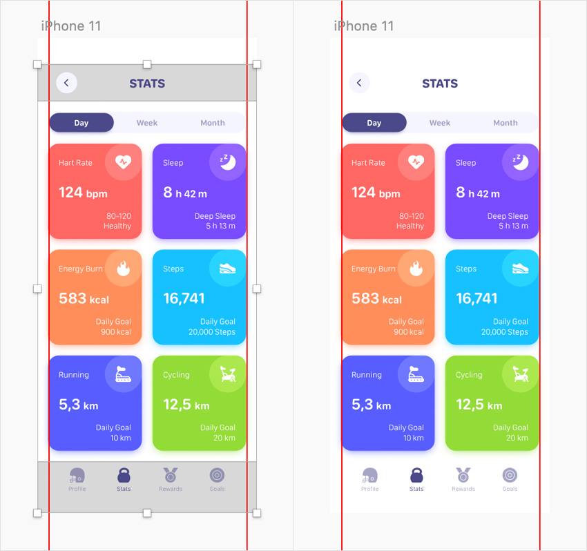
Congratulations! Your Fitness App Dashboard is Finished!
Here is how it should look. I hope you’ve enjoyed this free fitness app mockup tutorial and can apply these techniques in your future projects. Don’t hesitate to share your final result in the comments section.
Feel free to adjust the final fitness dashboard template and make it your own. You can find some great sources of inspiration at GraphicRiver, with interesting solutions to improve your fitness UI kit.

Want to Learn More?
We have loads of Sketch UI tutorials on Tuts+, beginner to intermediate level, take a look!
 SketchHow to Design a Money Management App UI in Sketch
 SketchHow to Design a Travel App Login Screen in Sketch
 Adobe XDSketch vs Adobe XD: Which One Should You Use?
 SketchA Walkthrough of the Prototyping Tools in Sketch
 SketchHow to Make User-Friendly and Reusable Sketch Files
 Responsive Web DesignTips and Tricks For a Responsive Design Process in Sketch
 SketchHow to Use Sketch Symbols to Create Flow Diagrams
 SketchHow to Create a Dynamic Icon Library With Sketch
 SketchQuick Tip: Recreate Apple Watch’s Activity Rings in Sketch
 TypographyHow to Create a Nautical Tattoo Font

from Envato Tuts+ Tutorials https://ift.tt/30InzSX


Excellent Blog I like your blog and It is very informative. Thank you
ReplyDeleteIONIC Online Course
Pega Online Course
Code Farming
ReplyDeletelaravel crud generator
source code generator
Hi, This post is superb so thankful to see this. you can also look our site. called Nimmio, we have free to download infographic presentation and free infographic template can help you win investors and clients.
ReplyDeleteValuable blog,Informative content...thanks for sharing, Waiting for the next update…
ReplyDeleteWhat is TOEFL Test?
Who needs to take TOEFL?
THANKS FOR GIVING WONDERFUL INFORMATION , KEEP POSTING Salesforce Training In Pune
ReplyDelete
ReplyDeleteThe well-known Business Process Management (BPM) tool PEGA was developed using Java ideas and enables users to modify more quickly than Java-based apps. PEGA is used primarily to cut expenses and advance commercial objectives. PEGA was developed using OOP and Java concepts. To learn more about Pega, join Pega Training In Chennai at FITA Academy.
Pega Training In Chennai
Corporate training is the process of educating employees using a variety of learning programmes through a system of activities. It serves as a catalyst for employee achievement, which in turn signifies your company's or organisation's overall success. According to a LinkedIn survey, 94% of employees said they would remain at a firm if it invested in their learning requirements because training is seen as a crucial aspect of their professional lives. To know more about corporate training features, join Corporate Training Companies In Chennai at FITA Academy.
ReplyDeleteCorporate Training Companies In Chennai