CSS: Center-Align List with Left-Aligned Text (and Unknown Width)
Here is a quick CSS tutorial showing how to center-align a list element with left-aligned text. For example, if you have an <ul> or <ol> of unknown width, and you want it to stay centered on the page and keep the inner text aligned to the left. That’s the trick we’re looking at in this tutorial.
Working on the testimonials page for my new bookstore, I wanted to center align the unordered list without specifying a width. When you specify a width, center-aligning is easy using margin: auto;. Like this example:
ul {
        width: 400px;
        margin-left: auto;
        margin-right: auto;
        }
When you go that route, you get a center-aligned list with all of the text aligned to the left. So this is the easiest solution for lists (and other elements) that have a known/set fixed width. But of course, I did not want to specify a width for this particular case.
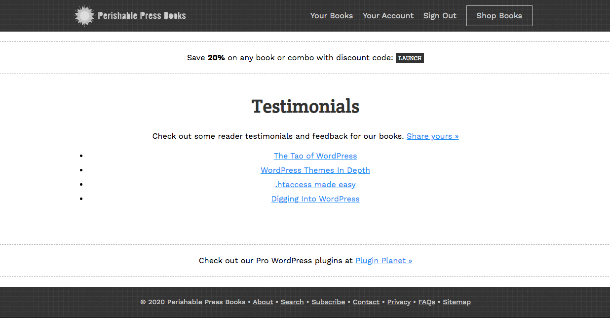
So without setting a width on the list element, I added text-align: center; to the parent div and got this:
The list bullets are displayed left-aligned, but the list text is center-aligned. So there is a strange gap between the bullets and the text for each list item. The solution is to make the list an inline-block and set its text-align to left. Here is the final code:
div.parent {
        text-align: center;
        }
ul {
        display: inline-block;
        text-align: left;
        }
And the HTML markup looks like this:
<div class="parent">
        <ul>
                <li>Item 1</li>
                <li>Item 2</li>
                <li>Item 3</li>
                <li>Item 4</li>
        </ul>
</div>
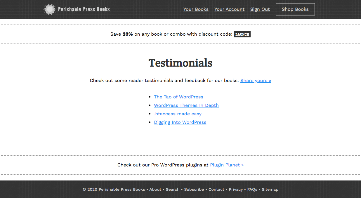
Here is the final result:
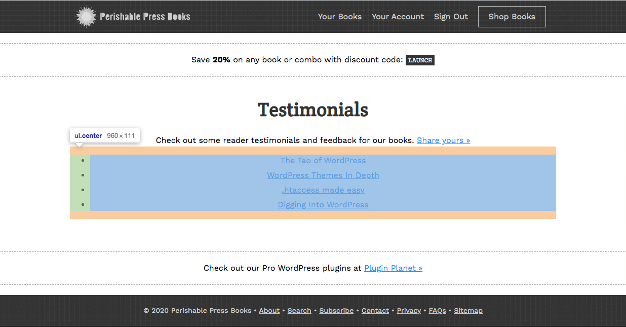
Mission accomplished. This technique also adds the benefit of respecting the margin of the preceding paragraph tag. Before we made the list inline-block, the vertical distance between the list and the preceding paragraph looked like this:
 With the list as a block-level element, the margins are collapsed with adjacent block-level elements
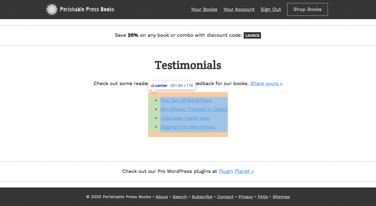
Notice how the paragraph bottom margin is ignored/collapsed, so the list sits close to the paragraph text. Now compare the vertical spacing after changing the list element to an inline-block:
Now the inline-block list respects the paragraph margin. So there is more vertical space and things don’t look so crowded.
Anyway, thought is was a neat technique to share. Enjoy!
from Perishable Press https://ift.tt/3hV5FVg


Comments
Post a Comment